Learn how to build, style, export, and automate consistent icons with Iconic.
Iconic 0.1.2 · updated September 14, 2026
Getting Started
Install Iconic, create your first project, and choose the right canvas and export sizes.
Installing Iconic
Download a build for your platform and run it - there's no installer step on macOS or Linux.
Iconic ships as a self-contained build for Windows, macOS (Apple Silicon and Intel) and Linux, so no .NET runtime is required. On Windows, run the installer and launch Iconic from the Start menu. On macOS and Linux, extract the archive and run the binary directly; you may need to mark it executable first with chmod +x Iconic. Projects and exported icons are written wherever you choose, so the app needs no special permissions.
Your First Icon
Build an icon from the default project, preview the result, and save or export it.
Start from the default project. Set the three color zones (outer fill, border stroke, inner background) to taste in the Border section - this is the frame every icon sits in. In Layers, use the Icon Library button to find a glyph or SVG and add it as a layer; adjust Offset X/Y and Scale until it sits where you want. Open Project Effects and add something like Bevel or Underglow to see the pipeline work. Choose Export to write the finished icon. Save the project as an .ipj file if you want to return to it - that file is also what batch processing and the CLI take as a template.
Canvas and Export Sizes
Choose a 72×72 or 144×144 canvas, then export at 72, 144, 256, or 512 pixels.
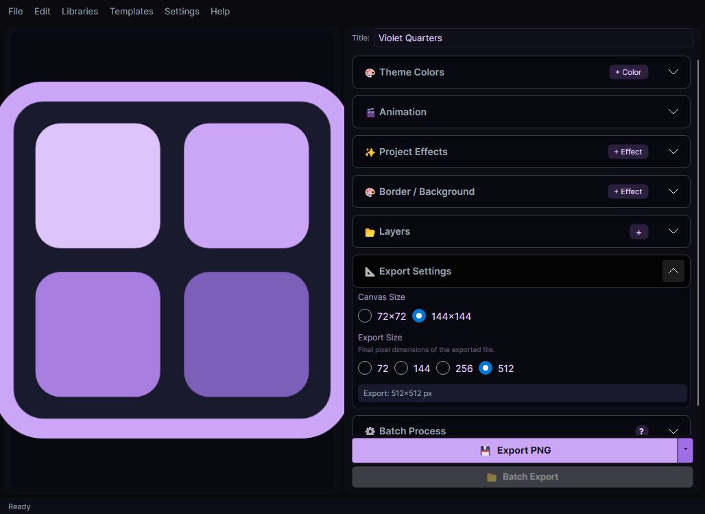
Canvas Size controls the coordinate space used to arrange the icon and can be 72×72 or 144×144. Export Size controls the final square image independently and offers 72, 144, 256, or 512 pixels; new projects default to a 144×144 canvas and a 512×512 export. Because layers are positioned proportionally, changing the export size scales the whole composition cleanly rather than cropping it.
Projects and Templates
An .ipj file holds the whole design and doubles as the template for batch and CLI runs.
Saving a project writes an .ipj file containing the canvas settings, every layer, and the full effect stack. Reopening it restores the design exactly. The same file is what you hand to batch processing or the CLI as a template, which is the key to consistency: design one icon, save it, then stamp that design across a folder of images. Keeping a few .ipj files around as house styles is usually more useful than starting from blank.
Core Concepts
Learn how projects and layers fit together before you start designing.
Icon Projects
A project is a single icon with its canvas settings, layers, and effects.
Every icon starts as a project. The canvas can be 72×72 or 144×144 pixels. Projects define the outer fill color, border stroke, inner fill, corner radius, and padding. Layers and effects are stored inside the project, which can be saved as an .ipj file and reopened later. Theme Colors let you define a named palette referenced via @Name syntax across the project.
Layer System
Build an icon by stacking images, library icons, and shapes with independent effects.
Each icon is made from layers that are combined into one image. Layers higher in the stack appear in front of layers below them. An image, library icon, or geometric shape can have its own position, scale, opacity, visibility, and effects. One image or icon layer can also act as the batch placeholder, allowing batch export to replace its content while preserving its styling.
Layer Types
The kinds of content a layer can hold.
Image - Import a PNG, JPG, or another supported image file. Icon - Pick a glyph or SVG from the Icon Library. Shape - Add a configurable geometric primitive such as a square, circle, or polygon. An Image or Icon layer can also be marked as the batch placeholder, which is replaced by each source image during batch export.
Features
Find the editor controls for layers, effects, exports, animation, batch work, and icon libraries.
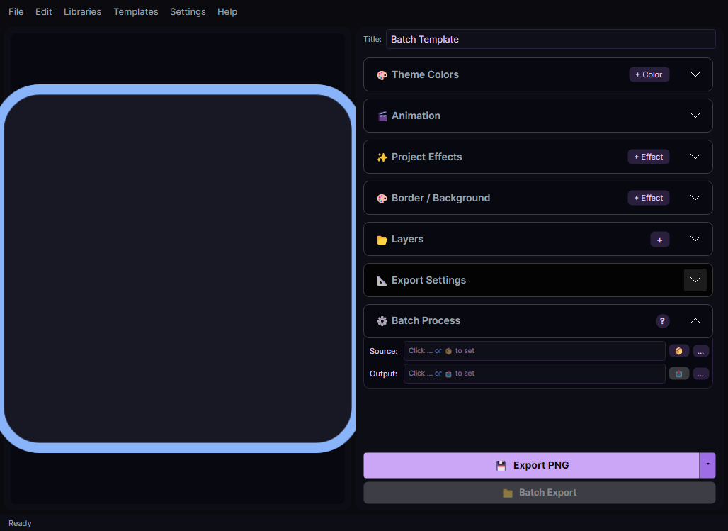
The editor is the central workspace. The left area shows a live preview of your icon (including animation). The right sidebar has accordion sections for Project Effects, Border/Background settings, Layers, and Batch Processing. Only one section can be expanded at a time. Use the toolbar at the top for New, Open, Save, and Export.
Undo
Step back through recent layer, effect, and project edits.
Undo restores the project state from before the most recent edit, including changes to layers, effects, colors, and project settings. Use Edit > Undo or Ctrl+Z. After undoing, making a different edit clears the redo history.
Redo
Reapply an edit that was just undone.
Redo reapplies the next edit in the undo history after you have stepped backward. Use Edit > Redo or Ctrl+Y. It is available only while an undone edit remains and is cleared when a new edit creates a different history path.
Layers
The Layers panel is where content is added, ordered, and given its own effects.
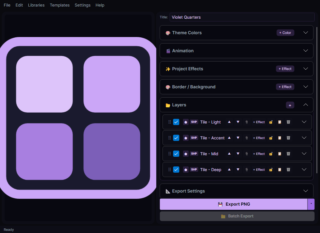
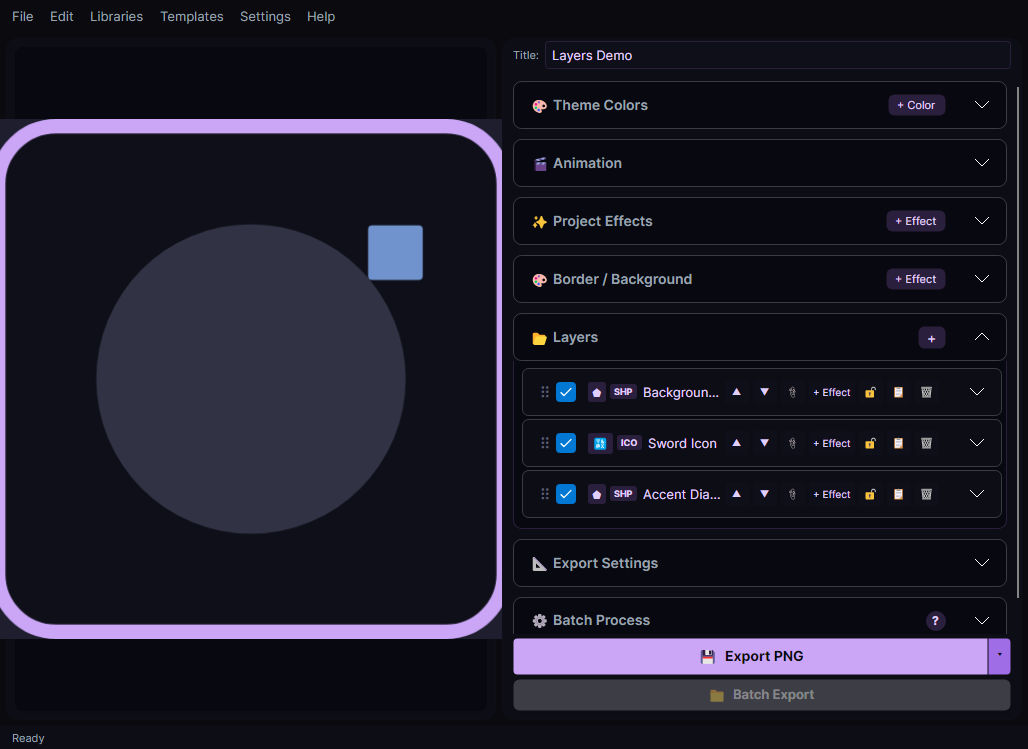
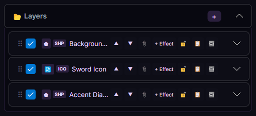
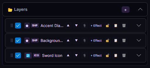
Everything inside the icon frame lives on a layer. The panel shows the frontmost layer at the top; lower rows are composited first and can be covered by rows above them. Each row expands to reveal that layer's position, scale, opacity, visibility and lock controls. Add per-layer effects to transform one layer without touching the rest, and mark one layer as the batch placeholder when batch processing should replace its content.
Add Layer
Add and select an empty Image layer that you can configure in the Layers panel.
Use Add Layer when you want to import an image manually. The new Image layer is selected immediately; expand its Properties, choose Browse, and then adjust its position, scale, opacity, or effects. The Layers section's + menu also offers an Icon Layer from the library and a geometric Shape Layer, keeping every supported layer type in one place.
Remove Layer
Remove the selected layer and its effects from the project.
Remove Layer deletes the selected layer, including its positioning and per-layer effects, and selects another remaining layer. If the removal was accidental, use Undo before making a new edit.
Move Layer Up
Move the selected layer one row toward the front of the composition.
Move Layer Up shifts the selected row upward in the Layers panel. Rows nearer the top are composited later, so they appear in front where layer content overlaps.
Move Layer Down
Move the selected layer one row toward the back of the composition.
Move Layer Down shifts the selected row downward in the Layers panel. Lower rows are composited earlier, so rows above them can cover their content.
Reorder Layers
Drag a layer to change where it sits in the stack.
Layers composite bottom to top, so their order decides what covers what. Drag a layer within the Layers panel to move it, or use Move Layer Up / Move Layer Down for single steps. Reordering re-renders the preview immediately, so it's usually quicker to drag and look than to reason about the stack.
Shape Types
Geometric shapes available for Shape layers.
Shape layers can draw Square, Circle, Triangle, Pentagon, Hexagon, Heptagon, or Octagon. Each shape supports a fill color, outline stroke, and corner rounding (where applicable).
Visual Effects
Stack effects on a layer, the border, or the finished icon.
Effects are stacked and applied in order. Attach them to an individual layer to transform just that content, to the border for edge treatments, or to the whole project so they run after all layers have been combined. Several effects can animate; when project animation and at least one effect's animation are enabled, the main Export action switches to animated output. See the Effects Reference for every effect and its controls.
Border & Background
A three-zone color system - outer fill, border stroke, and inner background.
Every icon is built on three color zones: the outer fill outside the rounded border, the border stroke itself, and the inner background behind your layers. Each takes an HSV picker or a hex value, or a @Name reference to a theme color. Border thickness, corner radius (0–72px) and padding control the shape.
Export Options
Export a square PNG, GIF, or APNG at 72, 144, 256, or 512 pixels.
Export uses the configured Export Size, independently of the 72×72 or 144×144 canvas. With project animation off, or with no enabled animated effect, the main Export action writes a PNG. When project animation is on and at least one enabled effect is animated, Export opens the animated save dialog with GIF as the default; choose Animated PNG there to write an APNG instead. New projects default to a 512×512 export.
Export to Stream Deck Export Folder
Save the current icon directly to your Stream Deck Export Folder.
Renders the icon at 144×144 and adds it to the Iconic Library Stream Deck icon pack. The icon appears immediately in the icon browser. Animated icons are exported as GIF.
Batch Processing
Folder-to-folder export - every image wrapped in your design, with per-image placeholder swapping.
Choose a source folder and an output folder. Each supported source image is swapped into the batch placeholder while preserving that layer's scale, effects, opacity, and position. If no placeholder is marked, the source is added as a new frontmost layer. Static projects write PNG files; projects with animation enabled on at least one active effect write GIF files. Enable Recolor on the placeholder to tint the batch consistently.
Smart Recoloring
Recolor every image in a batch to match your design, rasters and SVGs alike.
Enable recoloring on a placeholder layer and each batch image is retinted to that layer's color as it's composited. Raster images have their white and near-white pixels replaced; SVGs get their fill attributes overridden in a single pass. Useful for turning a folder of mismatched source icons into a consistent set.
Icon Library
Search built-in icons and the SVG folders you add from one place.
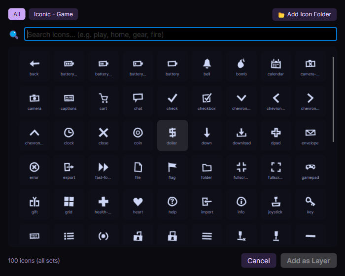
The Icon Library combines built-in icons with folders you choose. Point Iconic at any folder of SVG files and it becomes a searchable icon set, named after the folder; subfolders become search tags, so 'weapons/sword.svg' is findable by typing either. Icon fonts work too - drop a .ttf or .otf into the fonts/ folder next to the app and its glyphs appear alongside everything else. Pick an icon to drop it straight onto a new layer.
Projects
Save Project
Store the complete editable project in an .ipj file for later use.
Save Project preserves the canvas and export settings, layers, effects, animation, and theme colors in an .ipj file. The first save asks for a location; later saves update that same file. Saving the project is separate from exporting an image, and the .ipj file can also serve as a batch or CLI template.
Open Project
Replace the editor contents with a previously saved .ipj project.
Open Project loads the canvas settings, layers, effects, animation, theme colors, and export size stored in an .ipj file. The opened project becomes the current save target, and its state replaces what is currently in the editor.
New Project
Clear the editor and return to the default project settings.
New Project starts with a 144×144 canvas, a 512×512 export size, no layers or effects, and animation turned off. If the current project has unsaved changes, Iconic asks whether to save, discard, or cancel before resetting the editor.
Animation
A master animation toggle plus frame count and loop duration for the whole project.
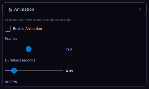
Animation is off by default, so effects render as a still even when animation is enabled on individual effects. Turn on project animation and enable animation on at least one active effect to preview a loop. The project's frame count and duration drive all animated effects together (FPS = frames ÷ seconds). Export then defaults to GIF, with APNG available in the animated export dialog; otherwise Export writes a PNG.
Theme Colors
Define a named palette once and reference it anywhere with @Name.
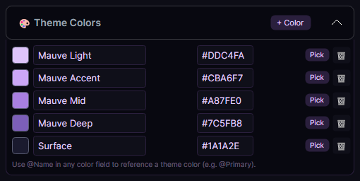
Add named colors to the project, then use @Accent (or any name you choose) wherever a color is accepted - layer colors, border and background zones, and effect parameters. Changing the palette entry updates everything referencing it, which makes recoloring a whole icon set a one-line edit.
CLI / Headless Mode
Render icons and run batch jobs from the command line, with no GUI.
Every batch operation the editor can do is available headlessly. iconic -render -out icon.png -template design.ipj renders a single icon; iconic -batch -source ./raw -out ./icons -template design.ipj stamps a design across a folder. Runs on Windows, macOS and Linux, which makes it straightforward to wire into CI or a build script.
Report an Issue
Prepare a problem report with contact details, a description, and an optional screenshot.
Open Help > Report an Issue to describe a bug or request help. Enter the email address associated with your account, a concise subject, and enough detail to reproduce the problem. You can attach one PNG or JPEG screenshot up to 5 MB; Iconic shows exactly what will be included and does not automatically attach projects, settings, or other files. Online submission remains unavailable until DCS account sign-in and the support API are connected.
Effects Reference
Compare the available effects, their parameters, and the places in a project where each can be applied.
✦
Glitch
Video stream corruption - buffering artifacts, macroblocking, row shifting, channel separation, and pixel dropout.
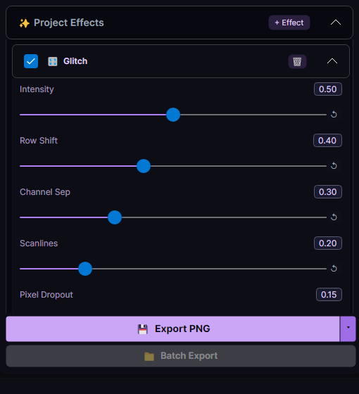
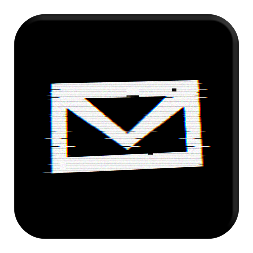
Simulates a corrupted video feed with configurable row shifting, RGB channel separation, scanline interference, pixel dropout, and block pixelation. When animated, the glitch intensity pulses over time for a dynamic, unstable look. Use the Phase parameter to desynchronize multiple Glitch instances on different layers.
Applies to
Layer, Project
Animated
Yes
Configurable parameters
Parameter
Range
What it does
Intensity
0 - 1 (default 0.5)
Overall glitch strength - scales all sub-effects together.
Row Shift
0 - 1 (default 0.4)
How far horizontal rows are displaced sideways.
Channel Sep
0 - 1 (default 0.3)
RGB channel offset distance for color fringing.
Scanlines
0 - 1 (default 0.2)
Visibility of dark horizontal scanline bands.
Pixel Dropout
0 - 1 (default 0.15)
Chance of random pixels being blacked out.
Pixelation
0 - 1 (default 0)
Block-level pixelation applied to corrupted regions.
Buffering
0 - 1 (default 0.35)
Simulates video buffering with frozen macro-blocks.
Noise
0 - 1 (default 0)
Random static noise overlaid on the image.
Scanline Shift
0 - 1 (default 0)
Vertical offset of the scanline pattern.
Phase
0 - 1 (default 0)
Animation phase offset to desynchronize multiple instances.
✦
Underglow
Radiates a colored glow from the border edge, either outward or inward.
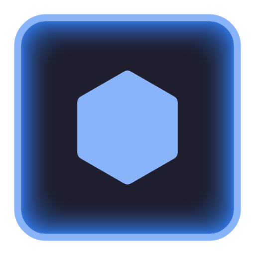
Adds a soft neon glow radiating from the icon's border. Toggle between outer glow (default) and inner glow. Adjust the hue color picker to match your icon theme. The Pulse parameter animates the glow intensity for a breathing effect.
Applies to
Layer, Project
Animated
Yes
Configurable parameters
Parameter
Range
What it does
Intensity
0 - 1 (default 0.6)
Brightness of the glow.
Spread
0 - 1 (default 0.4)
How far the glow extends from the border edge.
DirectionToggle
0 - 1 (default 0)
Switch between outer glow (default) and inner glow.
Glow ColorColorPicker
-
Hue of the glow color.
Saturation
0 - 1 (default 0.8)
Color saturation of the glow.
Pulse
0 - 1 (default 0.3)
Animated breathing intensity oscillation.
✦
Bevel
Adds a 3D beveled highlight/shadow to the border edge.
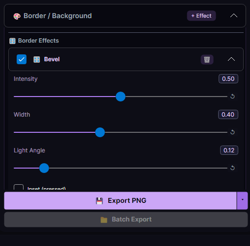
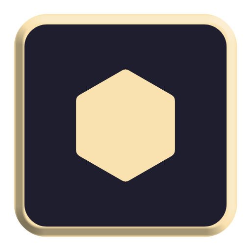
Creates the illusion of a raised or inset border by painting a light highlight on one edge and a dark shadow on the opposite edge. The Light Angle parameter rotates the virtual light source. Toggle Inset to switch from a raised button look to a pressed/recessed look. Requires a visible border - applied as a border effect that reads the project's border geometry.
Applies to
Border
Animated
Static only
Configurable parameters
Parameter
Range
What it does
Intensity
0 - 1 (default 0.5)
Strength of the highlight and shadow.
Width
0 - 1 (default 0.4)
Thickness of the bevel edge.
Light Angle
0 - 1 (default 0.125)
Direction of the virtual light source (0-1 maps to 0-360 degrees).
InvertToggle
0 - 1 (default 0)
Swap highlight/shadow for a pressed, inset look.
✦
Scanlines
CRT-style horizontal scanlines with adjustable spacing and padding.
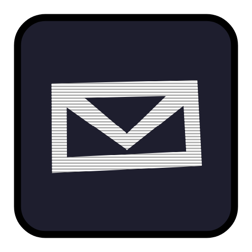
Overlays dark horizontal stripes to simulate a CRT monitor. Adjust spacing, thickness, and opacity to dial in the retro look. When animated, the lines scroll vertically at the configured speed. Use Padding to inset the scanlines from the icon edges. Combine with Glitch or Chromatic Aberration for a full retro-TV aesthetic.
Applies to
Layer, Project
Animated
Yes
Configurable parameters
Parameter
Range
What it does
Opacity
0 - 1 (default 0.3)
Darkness of the scanline bands.
Spacing
0 - 1 (default 0.3)
Gap between consecutive scanlines.
Thickness
0 - 1 (default 0.3)
Height of each scanline band.
Padding
0 - 1 (default 0)
Inset from the icon edges where scanlines begin.
Scroll Speed
0 - 1 (default 0.3)
Vertical scroll rate when animated.
Phase
0 - 1 (default 0)
Animation phase offset to desynchronize multiple instances.
✦
Chromatic Aberration
RGB channel offset for a broken-lens cyberpunk look.
Splits the red, green, and blue channels apart along a configurable angle, simulating a misaligned lens. Higher intensity pushes channels further apart. The Pulse parameter animates the separation for a glitchy, pulsing feel. Works well as a subtle accent (low intensity) or a dramatic distortion (high intensity).
Applies to
Layer, Project
Animated
Yes
Configurable parameters
Parameter
Range
What it does
Intensity
0 - 1 (default 0.4)
How far the RGB channels are offset from each other.
Angle
0 - 1 (default 0)
Direction of the channel split (0-1 maps to 0-360 degrees).
Pulse
0 - 1 (default 0.3)
Animated oscillation of the separation distance.
Phase
0 - 1 (default 0)
Animation phase offset to desynchronize multiple instances.
✦
Hue Shift
Rotate all colors through the spectrum - great for rainbow cycling.
Rotates every pixel's hue by the Shift amount. At 0.5, all colors flip to their complementary. Enable animation and set Cycle Speed to smoothly rotate through the full rainbow over the animation duration. Perfect for attention-grabbing animated icons.
Applies to
Layer, Project
Animated
Yes
Configurable parameters
Parameter
Range
What it does
Shift
0 - 1 (default 0.5)
Amount of hue rotation (0.5 = complementary colors).
Cycle Speed
0 - 1 (default 0.5)
Rate of continuous rainbow cycling when animated.
Phase
0 - 1 (default 0)
Animation phase offset to desynchronize multiple instances.
✦
Pixelate
Retro mosaic pixel-art downscale effect.
Downscales the image into chunky square blocks, averaging the color within each block. Larger Block Size creates bigger, more abstract pixels. When animated, the Pulse parameter oscillates the block size for a pulsing zoom effect. Great for retro game-themed icon layouts.
Applies to
Layer, Project
Animated
Yes
Configurable parameters
Parameter
Range
What it does
Block Size
0 - 1 (default 0.3)
Size of the mosaic pixel blocks.
Pulse
0 - 1 (default 0)
Oscillation depth for animated pixel block size changes.
Phase
0 - 1 (default 0)
Animation phase offset to desynchronize multiple instances.
✦
Outline
Adds a colored outline around the layer content.
Detects the non-transparent edges of a layer and draws a colored border around them. Adjust Thickness to control the outline width, and use the Color picker to set the hue. Useful for making icon glyphs pop against busy backgrounds. Layer-only effect.
Applies to
Layer
Animated
Static only
Configurable parameters
Parameter
Range
What it does
Thickness
0 - 1 (default 0.3)
Width of the outline border stroke.
ColorColorPicker
-
Hue of the outline color.
Saturation
0 - 1 (default 0.9)
Color saturation of the outline.
Lightness
0 - 1 (default 0.5)
Brightness of the outline color.
Opacity
0 - 1 (default 1)
Overall opacity of the outline.
✦
Drop Shadow
Adds a colored drop shadow behind the layer content.
Renders a blurred, colored shadow behind the layer's non-transparent pixels. Offset X/Y controls the shadow direction and distance. Blur softens the edge. Use the color picker to tint the shadow. Layer-only effect - great for giving icons a floating, elevated look.
Applies to
Layer
Animated
Static only
Configurable parameters
Parameter
Range
What it does
Offset X
-1 - 1 (default 0.2)
Horizontal displacement of the shadow.
Offset Y
-1 - 1 (default 0.2)
Vertical displacement of the shadow.
Blur
0 - 1 (default 0.4)
Softness and blur radius of the shadow edges.
ColorColorPicker
-
Hue of the shadow color.
Saturation
0 - 1 (default 0)
Color intensity and saturation of the shadow.
Lightness
0 - 1 (default 0)
Brightness of the shadow color.
Opacity
0 - 1 (default 0.6)
Overall opacity of the shadow.
✦
Dot Matrix
Retro dot-matrix display with soft glow and pulse animation.
Converts the image into a grid of dots (round or square) on a dark background, simulating a vintage LED display. Each dot samples the average color of its region and optionally adds a soft glow. Animate with Pulse to make the dots breathe. Toggle Round Dots for circular vs square dot shapes.
Applies to
Layer, Project
Animated
Yes
Configurable parameters
Parameter
Range
What it does
Dot Size
0 - 1 (default 0.35)
Radius of individual matrix dots.
Spacing
0 - 1 (default 0.3)
Gap between adjacent matrix dots.
Brightness
0 - 1 (default 0.8)
Brightness multiplier for active matrix dots.
Glow Intensity
0 - 1 (default 0.5)
Luminescence and halo strength surrounding lit dots.
Glow Spread
0 - 1 (default 0.4)
Diffusion radius of the dot matrix glow.
Pulse Amount
0 - 1 (default 0.35)
Oscillation depth for animated matrix pulsing.
Pulse Speed
0 - 1 (default 0.5)
Rate of brightness pulsing across frames.
Phase
0 - 1 (default 0)
Animation phase offset to desynchronize multiple instances.
Round DotsToggle
0 - 1 (default 1)
Render circular dots when enabled, or square grid blocks when disabled.
Background Darkness
0 - 1 (default 0.85)
Darkness of inactive gaps and background behind dots.
✦
Border Noise
Jagged / lightning-bolt border distortion.
Replaces the clean border stroke with a jagged, noisy path that evokes lightning bolts or organic edges. Intensity controls how far the noise displaces the border, while Frequency adjusts the grain. When animated, the noise crawls along the border. Border-scope only - applies between the border stroke and project effects.
Applies to
Border
Animated
Yes
Configurable parameters
Parameter
Range
What it does
Intensity
0 - 1 (default 0.4)
Distortion amplitude of the jagged border edges.
Frequency
0 - 1 (default 0.5)
Number of noise peaks and lightning-bolt ridges along the border.
Animate Speed
0 - 1 (default 0.3)
Speed of animated border shape perturbation.
Phase
0 - 1 (default 0)
Animation phase offset to desynchronize multiple instances.
Tips & Tricks
Use these workflows to create consistent icon sets and exports more efficiently.
Build a Palette with Theme Colors
Name your colors once, reference them with @Name, and recolor a whole icon set from one place.
Anywhere a color is accepted you can write @Accent instead of a hex value, pointing at a named entry in the project's theme colors. Change the palette entry and every layer, border zone and effect parameter referencing it updates together. This pays off most across a set: build one .ipj per house style with the same color names, and reskinning becomes editing a handful of palette entries rather than hunting through layers.
Desynchronize Effects with Phase
Identical animated effects on different layers look mechanical - offset their Phase to break it up.
When the same animated effect runs on several layers it steps in lockstep, which reads as artificial. Effects that expose a Phase parameter let you offset where each instance starts in its cycle. Giving each layer a different Phase keeps the effects related but not identical, and the result feels far more organic. Glitch in particular benefits from this.
Frames and Seconds Control Smoothness
Frame rate is frames ÷ seconds - trade file size against smoothness deliberately.
The project's animation settings are total frames and loop duration, and the effective frame rate falls out of the two: 120 frames over 4 seconds is 30fps. Using fewer frames generally reduces the exported GIF's size at the cost of smoothness. Slow, subtle effects like Underglow's pulse hold up at low frame counts; fast ones like Glitch need more frames before they stop looking choppy.
Unify a Mismatched Icon Set
Combine a batch placeholder with smart recoloring to normalize icons from different sources.
Source icons collected from different packs rarely share a color or weight. Mark the layer that receives batch images as a placeholder, enable recoloring on it, and set its color - every image in the batch is retinted as it's composited, so the output set is consistent regardless of what went in. Because the surrounding frame and effects come from your template, the result reads as one designed set rather than a folder of borrowed icons.
Script Regeneration with the CLI
Keep the .ipj in version control and regenerate icons from a build script instead of by hand.
Because the CLI takes the same .ipj the editor writes, the design can live in your repository next to the code that uses the icons. A single iconic -batch -source ./raw -out ./assets/icons -template ./design.ipj regenerates the whole set. Wiring that into a build step means a tweak to the template propagates everywhere on the next build, and nobody has to remember which icons needed re-exporting.